Black Friday Email Design: 7 Real Examples and What Breaks
Seven real Black Friday emails from Sonos, Ooni, Mammut and more, what makes each one work, and the design mistakes to check before you send.
Good Black Friday email design comes down to a few things: one clear offer at the top, big product photos, a single obvious button, and the reasons to buy right under the offer. The best examples also answer shoppers’ questions inside the email and sound like the brand. Below are seven real Black Friday emails and what each one does well, plus the design mistakes to check before you send yours.
What a Black Friday email is made of
Most strong Black Friday emails follow the same order, from the offer down to the small print. Here is that order, with what each part has to do.
1. Sonos: one offer, one button, reasons right below
Sonos keeps the top of the email to a single message, “Save up to 30%”, one sentence and one “Shop now” button. A large product photo sits under it, followed by three small promises: free shipping and returns, a price match, and an extended warranty.
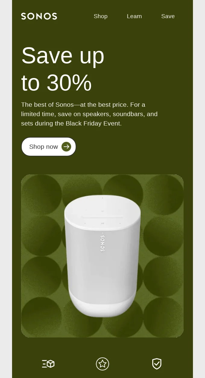
- Put the discount in the first words people see.
- Use one button above the fold. Two buttons split the click.
- Put your reasons to buy right under the offer, where people decide.
2. Ooni: answer the questions before people ask
Ooni leads with a huge “20% OFF almost everything” and then does something most Black Friday emails skip: a section of questions and answers. What counts as “almost everything”? Can the discount be combined with other offers? Will the shipping box give away a gift?
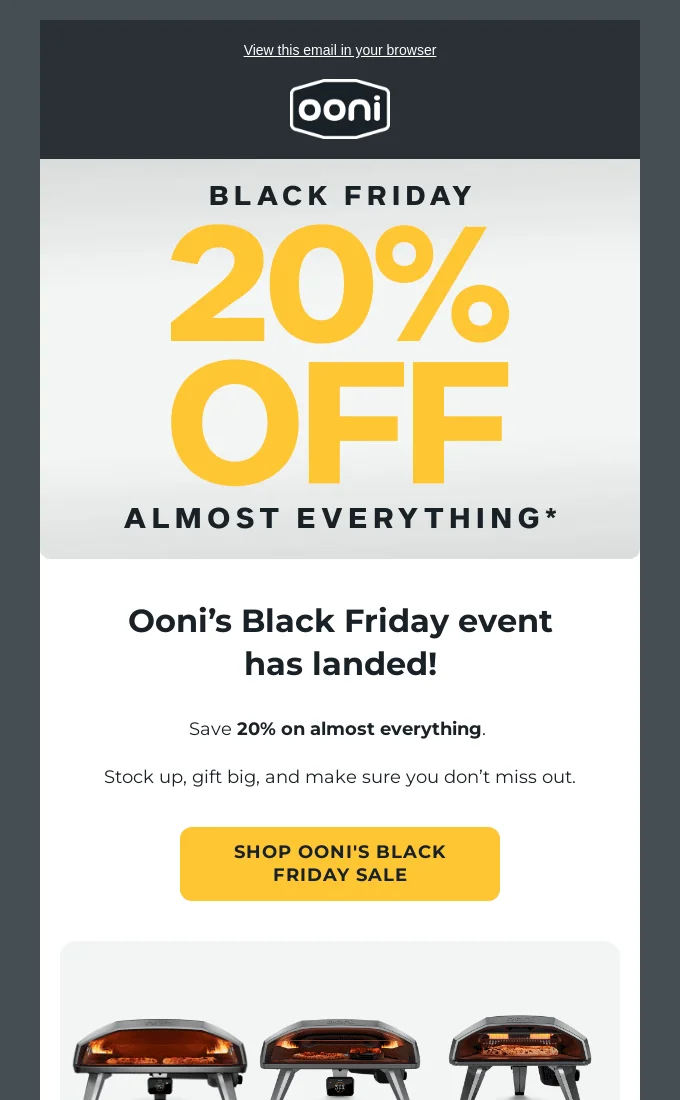
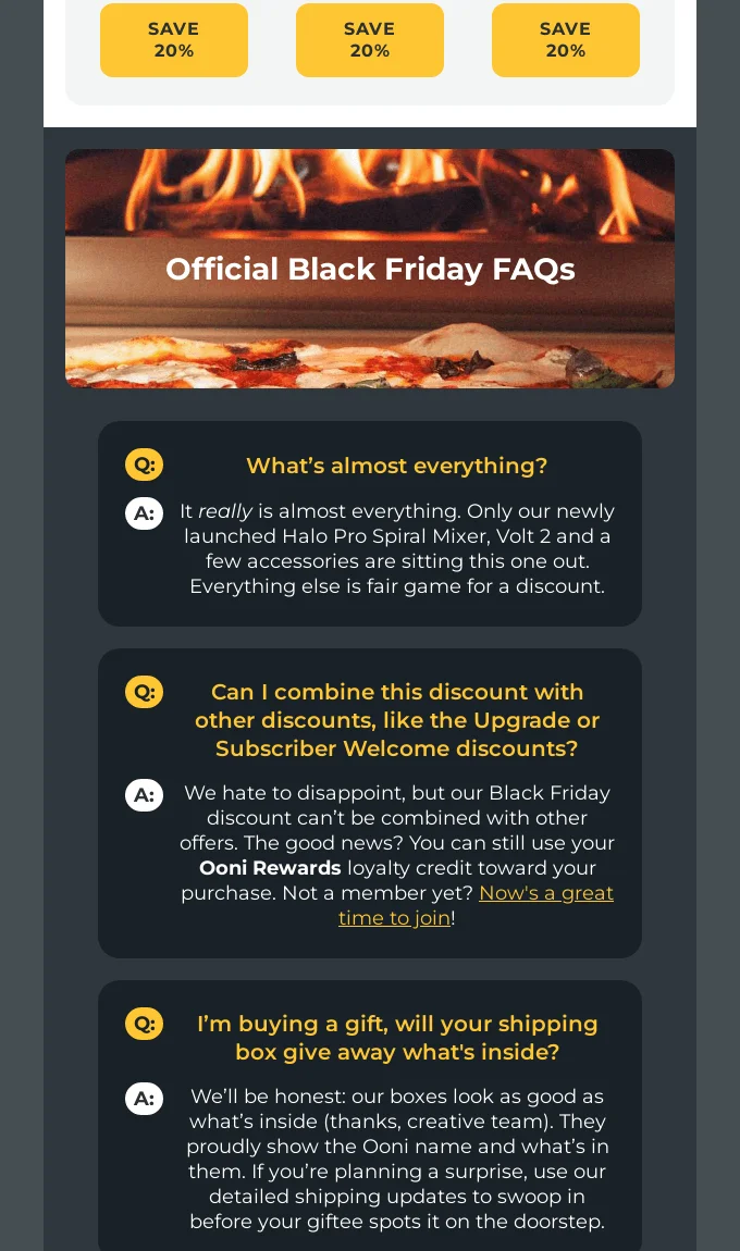
- If your offer has a catch, explain it in the email. An asterisk with no answer costs trust.
- Answer the two or three questions your support team hears every year.
- Gift buyers care about delivery dates and packaging. Say it.
3. Mammut: send people to the right shelf
Mammut opens with a loud black and yellow “BLACK FRIDAY SALE” and then gets out of the way: three big buttons for men’s, women’s and equipment, and a row of category photos below.
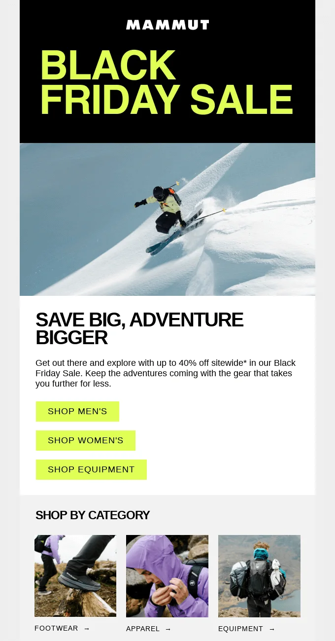
- Big category buttons work better on phones than a long list of small links.
- Keep the headline short enough to read in one look.
4. House of Blanks: make the day your own
House of Blanks turns its name into “Blank Friday”, then shows a tight grid of top deals with the discount in the section title.
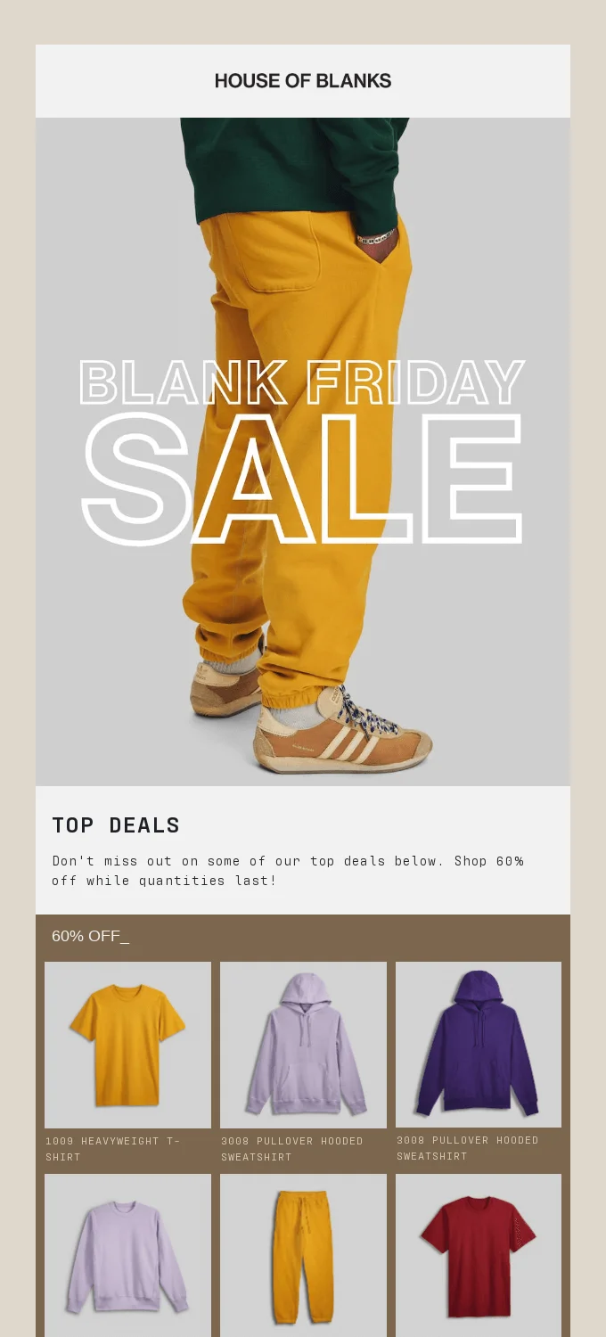
- A small twist on “Black Friday” makes your email stand out in a full inbox.
- Watch the length of product grids. A very long email gets cut off in Gmail, and the cut usually hides your footer. More in why Gmail clips messages.
5. Counter Culture: show the saving on every product
Counter Culture uses a bold checkered frame for “Black Friday Deals” and then groups products into bundles. Each bundle has a “Save up to 30%” badge on the photo and its own button.
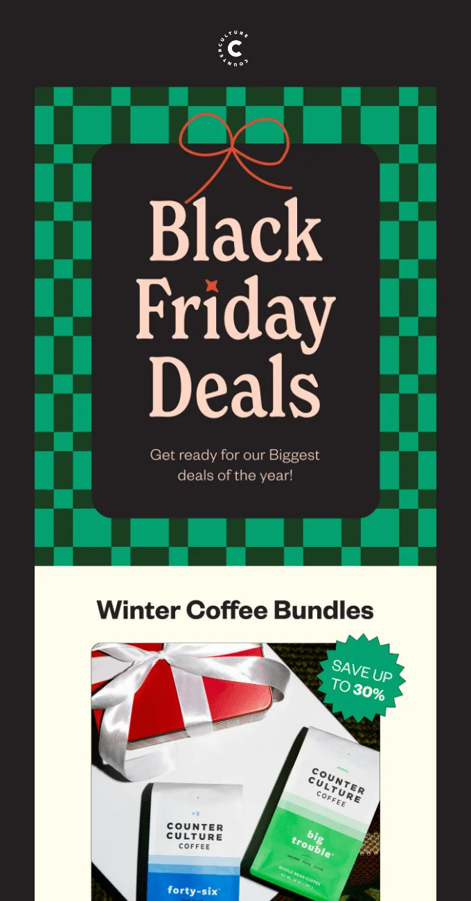
- A badge on the product photo tells the saving faster than a sentence.
- Bundles make gift shopping easier and raise the order value.
6. Alessi: warm people up before the day
Alessi sends a “Black Friday coming soon” email before the sale starts, with one line: “Stay tuned, more is coming soon.” It gets the brand into the inbox while competitors are still quiet.
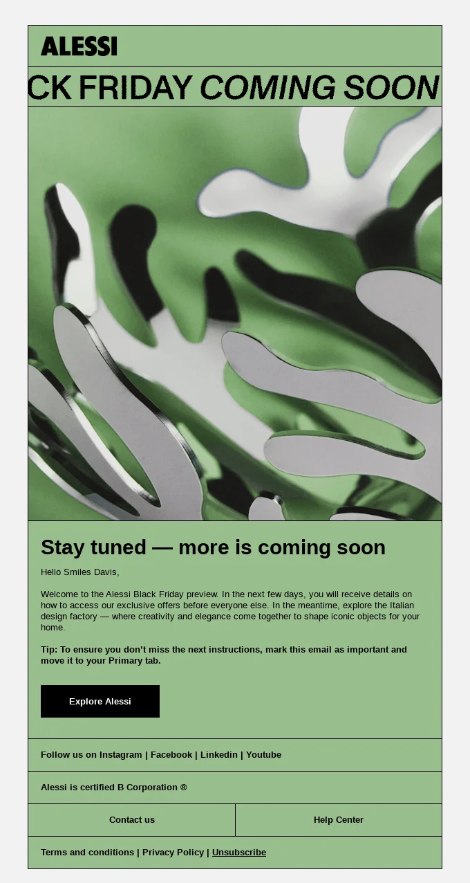
- A teaser a few days before Black Friday prepares people for the real offer.
- Keep it short. Its job is to make people look for your next email.
7. Bubble: let your voice do the work
Bubble’s email is bright blue and playful: “Our Best Sale of the Year”, then “We know it’s Monday, but we don’t care”. The tone matches the brand, so the email reads like Bubble even with the logo covered.
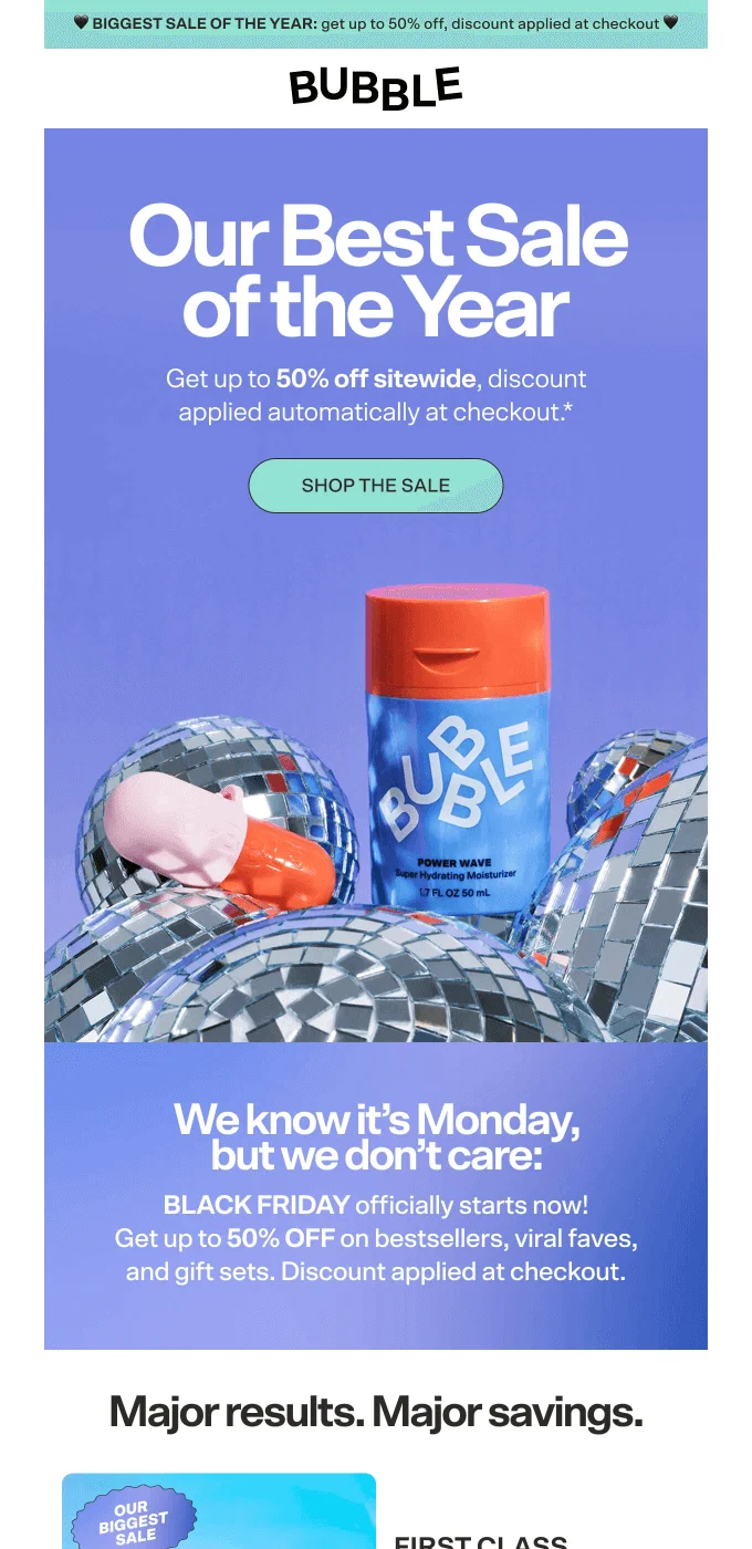
- Every brand is shouting “SALE” that week. Your tone is what people remember.
- Bright colors work when they’re your colors.
What breaks in Black Friday designs
The examples above look great in the designer’s file. These are the problems that show up when the same design reaches real inboxes.
The offer is only in the picture. Some people read email with images turned off, and some mail apps block images until the reader allows them. If “30% OFF” lives only inside a picture, those readers see an empty box. Write the offer as real text, and give every picture a short description.
The email is too long. Big product grids and extra sections add up. Past a certain size, Gmail cuts the email off and hides the rest behind “View entire message”, footer included.
Light text on a busy photo. A white price over a light photo looks fine on a big screen and disappears on a phone in the sun. EmailStitch flags text with very low contrast.
One language gets left behind. When a sale goes out in several languages, the German version often keeps an English “SALE” or an empty button. Review checks every language for empty and untranslated text.
If you want to check your own Black Friday email this way, start free in EmailStitch. Before you send, also run through the Black Friday email checklist, and if you use a timer, see how to add an email countdown timer.